Data Visualization
Whether it's crafting a storytelling dashboard, designing a scientific plot, or bringing data to life through sleek infographics, I blend the power of tools like Tableau and Power BI with the flexibility of Python and JavaScript to turn complex data into visual experiences that are both intuitive and impactful.
Example of Tableau Dashboard
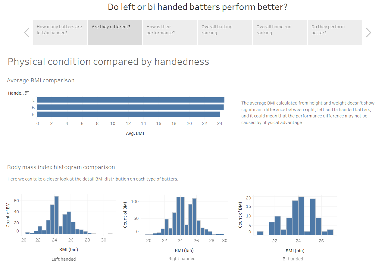
This visualization is about finding the difference between right-handed batters and left/bi-handed batters in baseball game and explaining how left-handed and bi-handed batters exceed in the performance in terms of batting average and home runs. It starts from finding out how many percent of the total players contained in the dataset are left or bi handed players and further reveals the difference in the performance.
Other examples
I work with a wide range of popular visualization libraries in Python and JavaScript—such as Matplotlib, Seaborn, Plotly, D3, and Plot—choosing the best fit for each task. Beyond that, I can build custom visualizations from the ground up using HTML, CSS, and JavaScript, making the possibilities virtually limitless. Here are a few examples.
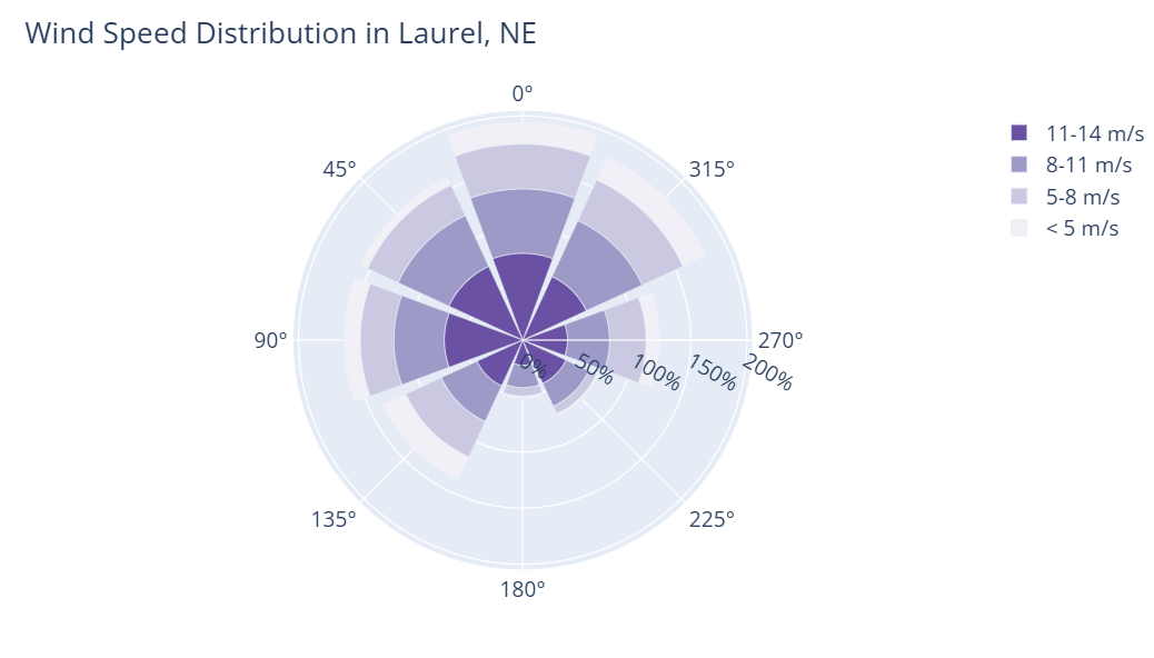
Basic Wind Rose Chart - An exmple from Plotly
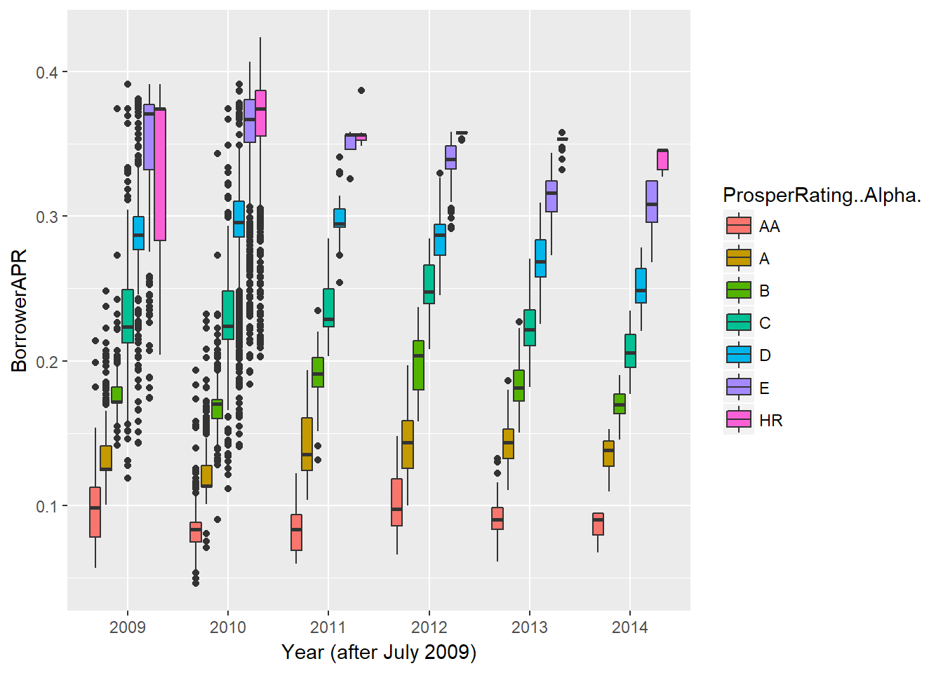
Multivariate plot - From my personal loan analysis
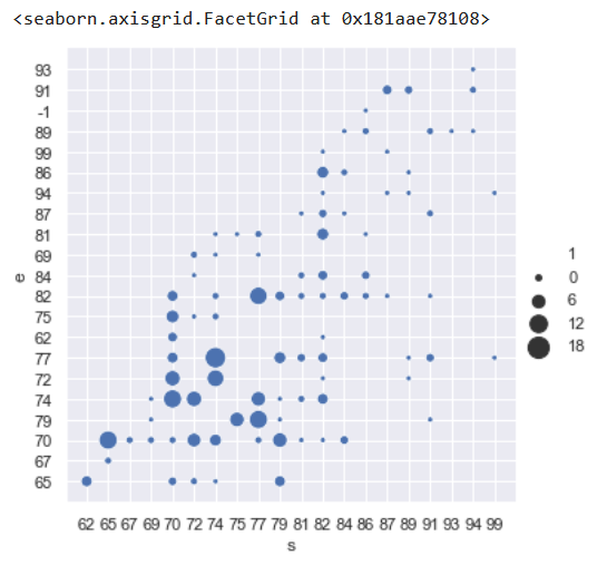
Seaborn replot - An exmple from my music score analysis